Avarta
Where Technical Precision
Meets Creative Vision
IT and Design Solutions Pvt. Ltd.
Brand
Foundation
The strategic core. Why Avarta exists, what it believes, and who it serves.
Brand Story & Origin
Dr. Krishnachandran completed his M.Tech and PhD at IIT Kanpur in fluid and thermal sciences, then spent years simulating blood flow inside cerebral aneurysms at a level most laboratories can't reach. Radhika Prasad graduated from the National Institute of Design with a Masters in experience and communication design, and went on to lead departments, shape curricula, and sit on institutional boards.
Two people. Two completely different worlds. One company. The name Āvarta (आवर्त) comes from Sanskrit — vortex, revolving current. In fluid dynamics, a vortex is where forces converge and generate extraordinary effect from disciplined motion. The name is not a metaphor. It is the philosophy, made visible.
Brand Purpose
"To improve the quality of life by applying deep technical and design intelligence to real-world challenges."
Vision
"To become a globally respected interdisciplinary think tank and consultancy shaping the future through research, systems thinking, and meaningful design — built in India, trusted by the world."
Mission
"To bridge physics, computation, design, and education in order to solve complex problems, generate insight, and build long-term capability across industry and academia."
Note the word bridge. We don't pick a side. We build the connection.
An interdisciplinary think tank and consultancy where technical precision meets design intelligence.
Intelligence
in Motion
Interdisciplinary Intelligence
We don't think in silos. Engineering depth and creative breadth aren't opposites — they're the whole point.
Fundamental Thinking
We go beneath the surface. First principles, not surface fixes. We'd rather take longer and be right than be fast and be wrong.
Systems in Motion
We think in relationships, not parts. Flow, interaction, and emergence are how we understand the world — and how we solve problems in it.
Knowledge as Capability
We build capacity, not dependency. When we leave a project, the people we worked with should be stronger for it.
Purposeful Impact
Research should translate to real benefit. Design should do more than look good. If it doesn't create meaningful outcomes, we're not interested.
Sage-led. Creator-shaped. Explorer-energised.
The Sage
Deep, considered, authoritative. Speaks from earned understanding. Shares knowledge to create capability.
The Creator
Imaginative, craft-driven, deliberate. Transforms complexity into elegant, purposeful form.
The Explorer
Curious, boundary-pushing, energised by the unknown. Always seeking what lies beyond the familiar.
Brand Voice
& Language
How Avarta speaks. The tone, the words, the rhythm.
How We Sound
Avarta sounds like
- Precise not stiff
- Confident not boastful
- Warm-intellectual not sterile
- Visionary not vague
- Sophisticated not elitist
- Calm and grounded
Never like
- Vague or generic
- Hype-driven
- Cold or clinical
- Over-academic
- Condescending
- Trendy or reactive
Where Technical Precision Meets Creative Vision
Avarta's Strongest Lines
These lines have been earned. Don't discard them lightly. The strategic idea that runs beneath everything — Intelligence in Motion — is for internal alignment only, not external use.
How We Write
Write from understanding, not from pressure to sell. Emphasise what something means before you list what it delivers.
Frame Avarta as a thinking partner — not a vendor. We speak with kindness, precision, and quiet confidence.
Never use "cutting-edge," "world-class," or "revolutionary" without evidence to back them up.
State assumptions and limitations clearly. Rigour includes knowing what we don't know — and saying so.
Headlines are short, clear, built to pull the reader in. A headline is a promise — make sure the copy keeps it. Avoid exclamation marks. We don't shout.
Sentence case for all headings. British English preferred. Use the em dash (—) for parenthetical statements. Contractions are welcome — we speak human.
Logo
System
The vortex mark. Its meaning, its rules, its application.
The Vortex Mark
The Avarta mark is a vortex — four curved blades rotating around a central void. This is not decoration. This is physics, made visible. In fluid dynamics, a vortex is the fundamental structure that emerges when a system encounters organised motion, pressure differential, and rotational force simultaneously. It is where energy concentrates and where change becomes possible.
The circular containment signals wholeness — systems thinking, completeness, integrity. The counter-rotation of the blades signals interdisciplinarity — two forces, not competing, but together generating something neither could alone. The central void is the point of convergence. The wordmark "avarta" is set in lowercase, always — authority that doesn't need to shout.
Full set of approved logo and wordmark combinations
Use these dark-safe files only on deep navy and similarly dark brand backgrounds.
Default for everything — decks, proposals, website header, letterhead
Default for everything — decks, proposals, website header, letterhead
Square formats, social media avatars, merchandise
Favicon, app icon, embossed print, pattern use, secondary placements where the wordmark has already appeared
Where the mark has already been established on the same piece
Dark or coloured backgrounds where full colour isn't possible
Light or white backgrounds where full colour isn't possible
Limited use only: launch materials, event collateral, special campaigns
When using the symbol-only mark, ensure the Avarta name is visible somewhere nearby. The mark alone is powerful — but brand recognition requires the name to be present in the broader context.
Exclusion Zone
The exclusion zone on all four sides must equal the height of the letter 'a' in the wordmark — the X-unit. As the logo scales, the X-unit scales with it automatically.
| Application | Digital | |
|---|---|---|
| Full Logo | 120px wide min | 30mm wide min |
| Symbol Only | 32px wide min | 8mm wide min |
Approved Uses
- Use on approved background colours only
- Maintain minimum size at all times
- Respect the clear space exclusion zone
- Use provided file formats (SVG, EPS, PNG)
- Left-align the logo — aligned to the primary grid
- Use the master SVG or EPS files — never recreate from a screenshot
Common Errors
- Do not stretch, squash, skew, or distort the logo
- Do not edit the logo colour or use an off-brand version
- Do not reduce the logo opacity
- Do not add graphic effects — no drop shadows, outlines, or glows
- Do not place on a high-contrast pattern or busy photograph
- Do not change the layout between mark and wordmark
- Do not encroach on the required clear space
Color
System
A palette built for depth, precision, and controlled energy.
The colour system begins with a single strategic truth: we live at the intersection of deep science and precise form. The palette must communicate both — depth without coldness, energy without noise, precision without sterility. Deep Space Navy is the foundation. Electric Cobalt is the active colour of the system — the colour that moves, that directs, that calls to action. Luminous Cyan-Green is the accent that cuts through the dark system, mapping directly to fluid dynamics and simulation environments.
Midnight Void [Navy]
#00022B
RGB(0, 2, 43)
Brand foundation · Primary dark background
Cobalt Pulse [Blue]
#0050FF
RGB(0, 80, 255)
Primary brand blue · Active colour · CTA
Flow Signal [Cyan]
#00E5C3
RGB(0, 229, 195)
Primary accent · Highlight · Distinction marker
Stellar White [White]
#F0F2F8
RGB(240, 242, 248)
Primary type on dark · Light surface
Orbit Blue [Cobalt]
#1A2A5E
RGB(26, 42, 94)
Secondary surface · Mid-tone layer · Structural depth
Indigo Veil [Indigo]
#2E2B78
RGB(46, 43, 120)
Atmospheric depth · Gradient base
Vortex Plum [Purple]
#7B4495
RGB(123, 68, 149)
Gradient mid · Conceptual depth
Flux Rose [Magenta]
#A3518F
RGB(163, 81, 143)
Gradient end · Softer expression
Luminous Cyan-Green
#00E5C3
RGB(0, 229, 195)
"The accent that cuts through the system. Used for rule lines, underlines, data highlights, section dividers, and distinction markers. Never as background fill. Never as body text on coloured grounds."
Cyan Mid
#00C4A8
Softer accent variant for graphs and secondary highlights.
Electric Glow Panel
radial-gradient(circle at center,
#0035CC 0%, #0050FF 35%,
#04033A 75%, #00022B 100%)
Deep Blue Ambient
radial-gradient(circle at center,
#0050FF 0%, #0C1996 40%,
#04033A 100%)
Orb Glow
radial-gradient(circle at center,
#001FCC 0%, #0035CC 30%,
#04033A 65%, #00022B 100%)
Cobalt Depth
linear-gradient(135deg,
#0050FF 0%, #1A2A5E 50%,
#04033A 100%)
Banner Gradient
linear-gradient(180deg,
#2E2B78 0%, #7B4495 58%,
#A3518F 100%)
Dark Theme Proportions
#00022B
60–70%
#0050FF
15–25%
#00E5C3
5–10%
#F0F2F8
rest
Accessibility · Contrast Ratios
Typography
System
The typefaces. Their logic, their hierarchy, their rules.
Degular
Intelligence
in Motion
Geometric Display · All headings, display text, wordmark
DM Sans
Where technical precision meets design intelligence. Avarta operates at the intersection of disciplines — where the most complex problems live and the most valuable solutions are found.
Precision-engineered screen typeface · Clear at all sizes
JetBrains Mono
#0050FF
RGB(0, 80, 255)
--electric-cobalt
Used exclusively in code references, specs, and data labels
| Level | Typeface | Size | Weight | Tracking | Color |
|---|---|---|---|---|---|
| Display / Cover | Degular | 80–96px | 700 | −0.02em | #FFFFFF |
| H1 Section | Degular | 48–56px | 700 | −0.01em | #FFFFFF |
| H2 Card | Degular | 28–36px | 600 | −0.01em | #0050FF |
| H3 Sub | Degular | 22–26px | 500 | 0 | #F0F2F8 |
| Body | DM Sans | 16px | 400 | 0 | #F0F2F8 |
| Caption | DM Sans | 13px | 400 | 0 | #6B7280 |
| Label / Tag | DM Sans | 11px | 600 | +0.08em | #00E5C3 |
| Code / Technical | JetBrains Mono | 13px | 400 | 0 | #00E5C3 |
Stay left-aligned, rag right. Legibility and clarity are vitally important. Do not centre multi-line text. Do not fully justify paragraphs. No exceptions.
Skip weights, double sizes. When pairing two weights, skip a weight between them. When sizing two elements relative to each other, consider doubling the size. This creates clear hierarchy.
Align x-heights or baselines. When placing text elements next to each other, align either baselines or x-heights. This creates visual order.
Watch the rag. Keep an eye on the right edge. If the rag creates a recognisable shape unintentionally, tweak the language or resize the container. Avoid single-word lines at paragraph end.
Give things room. Negative space around elements is vital. If informational elements belong together, move them closer. Don't cram. Don't spread for the sake of filling space.
Keep line length reasonable. Lines between 60 and 75 characters ensure legibility whether size increases or decreases. It is easy to get lost in long lines — and short ones get skipped.
Design
Language
The visual world. How Avarta looks when it's fully itself.
"Advanced research energy — not generic corporate tech."
Luminous Depth
Dark grounds with saturated colour cores. Every surface implies something further beneath.
Technical Precision
Grid-aligned, measured, deliberate. No decoration without purpose. Structure is aesthetic.
Organic Intelligence
Fluid forms, vortex geometries, and natural systems as the source of visual logic.
Structural System
Visual Vocabulary
The Vortex Form
Primary graphic device. Used at 5–8% opacity as background ghost texture, watermark, and structural element.

The Grid
Technical mesh referencing CFD meshing and numerical simulation. Used as background texture.
The Cyan-Green Rule
The brand's signature editorial mark. A 1px luminous cyan line used as divider and structural accent.
Approved
- Technical environments: labs, computation centres, simulation renders
- Human presence in the act of thinking — not posing
- Nature as reference: fluid surfaces, vortex patterns, turbulent flows
- High contrast, dark-toned, cool colour grading
- Abstract technical imagery: CFD visualisations, mesh structures
Never
- Generic stock imagery: handshakes, smiling people at desks
- Warm dominant tones: orange, yellow, red-heavy palettes
- Low resolution or compressed photography
- Overly processed, over-saturated lifestyle imagery
- Unrelated visual clichés: light bulbs, gears, generic arrows
Brand
Assets
Everything you need. Download, use, don't reinvent.
Applied Design
Branded collaterals in print and digital. Each piece is an expression of the Avarta visual system — applied with precision.
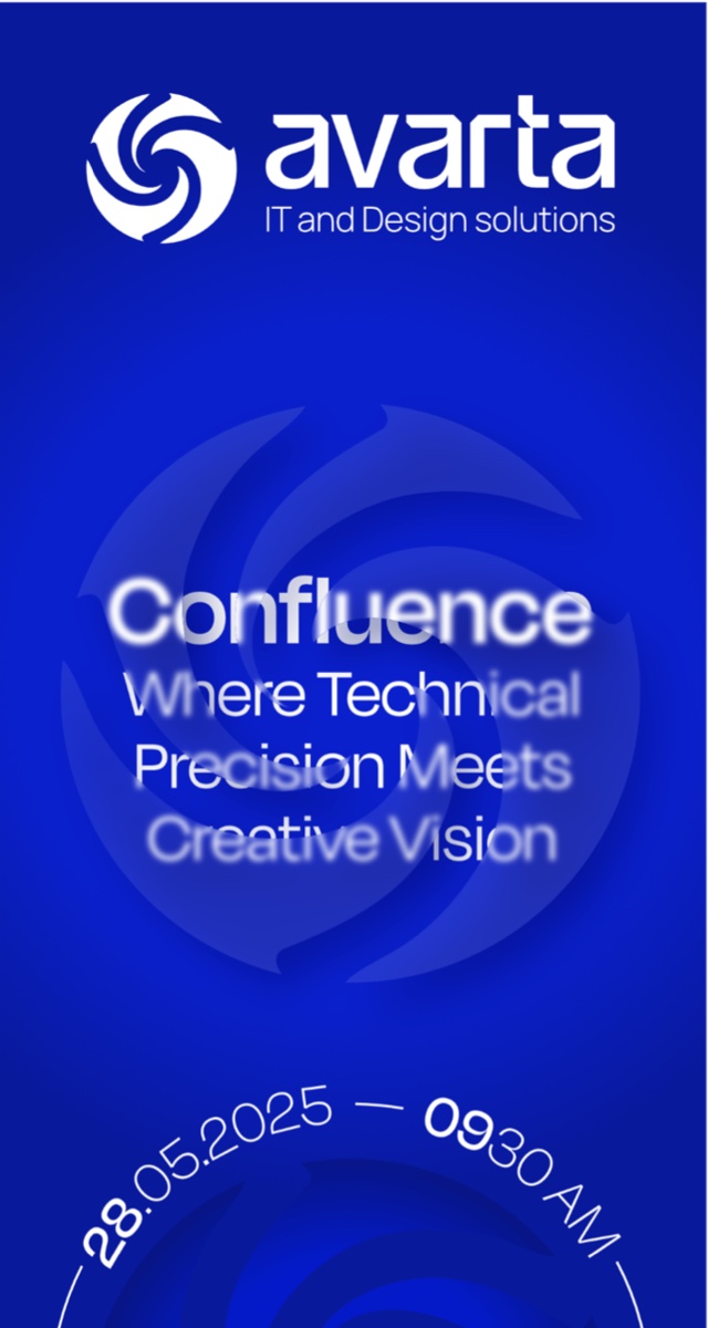
Avarta Invite
.PDF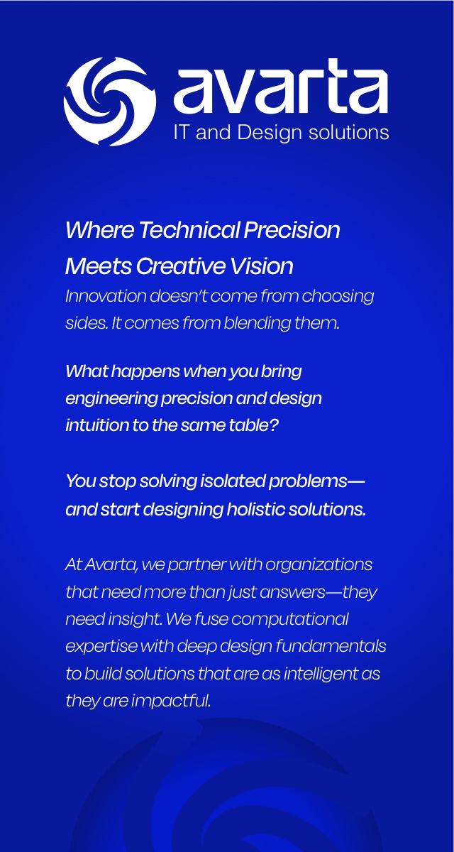
Avarta Brochure
.PDF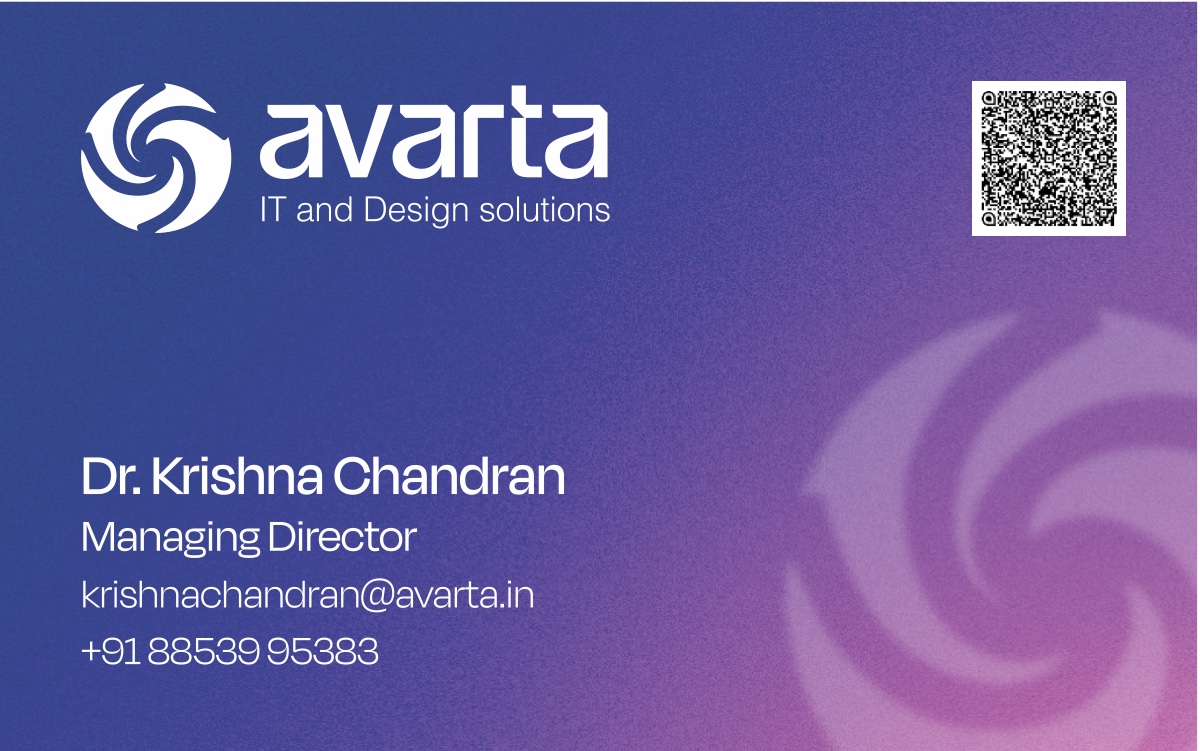
Visiting Card
.ZIP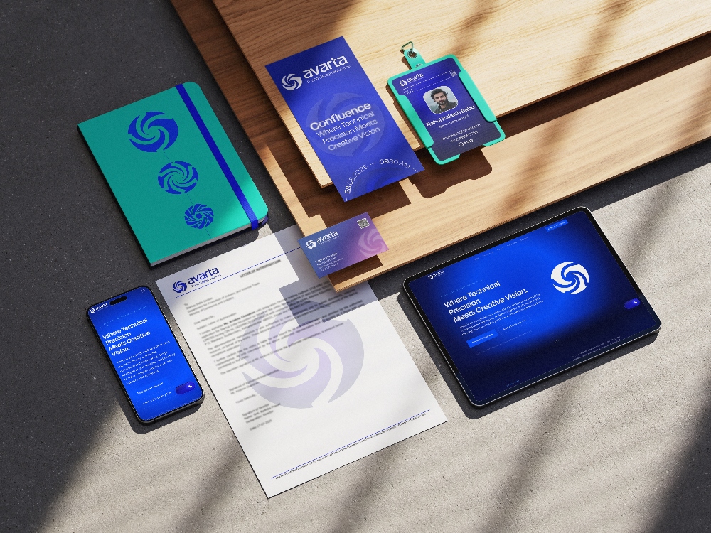
Stationery Mockup
.JPG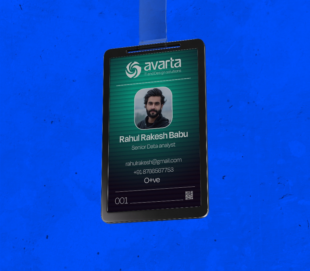
ID Card Mockup
.JPG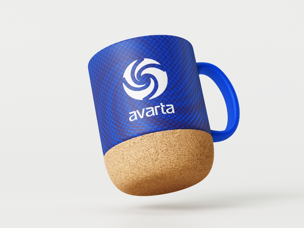
Coffee Mug Mockup
.JPG
LinkedIn Company Banner
.JPG
Dr.Krishnachandran LinkedIn Banner
.JPG
Radhika Prasad LinkedIn Banner
.JPG
YouTube Banner
.JPGAvarta Brochure
Brand brochure for client presentations and distribution. Full visual identity showcase.
.PDF Download ↗Bookmarks
Branded bookmarks for events, gifting, and client engagement. Print-ready files.
.ZIP Download ↗Letterhead
Letterhead and authorization templates for official branded documentation.
.ZIP Download ↗Signages
Signage-ready assets for office, events, and branded environmental applications.
.ZIP Download ↗Visiting Card
Business card template, front and back. Print-ready, CMYK, bleed included.
.ZIP Download ↗Stationery Mockup
Branded stationery suite mockup. Notebook, business card, letterhead, and digital devices.
.JPG Download ↗ID Card Mockup
Branded ID card mockup. Avarta identity card design in a realistic presentation.
.JPG Download ↗Coffee Mug Mockup
Branded coffee mug mockup. Avarta merchandise design in a studio-quality render.
.JPG Download ↗LinkedIn Company Banner
LinkedIn company page banner for brand-consistent profile presentation.
.JPG Download ↗Dr.Krishnachandran Linkedin Banner
Linkedin personal header banner for Dr.Krishnachandran's individual profile branding.
.JPG Download ↗Radhika Prasad Linkedin Banner
Linkedin personal header banner for Radhika Prasad's individual profile branding.
.JPG Download ↗Email Signature
Branded email signature template. Copy and paste into your mail client.
.DOCX View ↗Workshop Event Agenda Deck
Event agenda presentation for Avarta workshops. Branded slide deck with session structure.
.PPTX Download ↗Avarta Workshop Deck
Core workshop presentation deck. Fully branded with Avarta visual identity.
.PPTX Download ↗Services Overview — Design
Services overview presentation for design-focused engagements. Brand story and offering summary.
.PPTX Download ↗Services Overview — CFD
Services overview presentation for CFD (computational fluid dynamics) prospects.
.PPTX Download ↗Color Palette
ASE swatches (Adobe + Affinity), Figma tokens, CSS/SCSS variables, Canva CSV, design tokens, GIMP/Inkscape palette, and visual swatch card.
.ZIP Download ↗Logo Mark Assets
Complete logo mark pack — all variants: SVG, EPS, PNG. Colour, mono, reversed.
.ZIP Download ↗Font Files
Degular Display and DM Sans — all weights and styles. OTF and TTF formats.
.ZIP Download ↗